


The visual curse no one talks about.
Looking junior even when you’re not.

Why Most Creators Look Junior (And How to Fix It)
You’re a smart creator.
You show up. You write.
You teach. You give value.
But your posts still look… DIY.
Not in a good, charming way.
More like “this person just discovered Canva yesterday” kind of way.
That’s the visual curse no one talks about.
Looking junior even when you’re not.
Because if your design feels off, people assume you are off.
And they scroll past.
Here’s the good news:
You don’t need to be a designer.
You don’t need to learn Photoshop.
And you don’t need a logo to “look branded.”
But you do need to fix a few key visual signals that quietly build trust or slowly drain it.
🔒 Inside today’s paid post:
🔤 How to choose font pairings that build instant trust
📐 The layout rule most Canva users break (and how to fix it)
🧱 Why templates hurt more than help and how to fix them
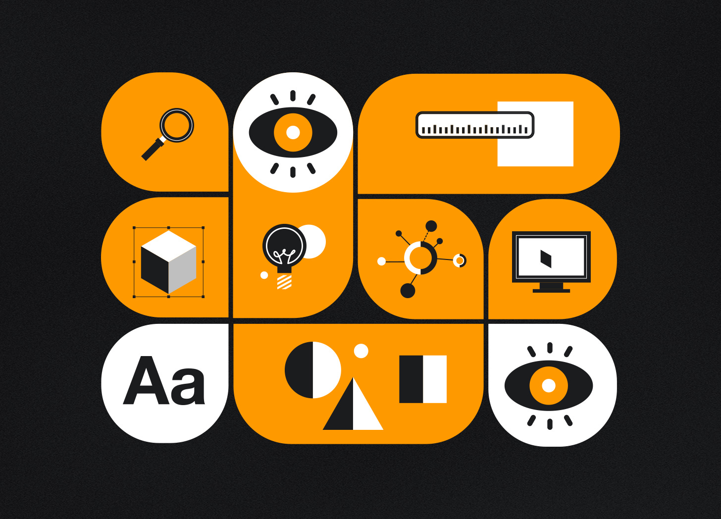
🧭 The 5-part visual style system I use for every client
🚨 How to spot (and avoid) “junior” design mistakes
🧰 My full setup and tools with sneak peeks inside my system
This post is for paid subscribers only.
If you’re serious about building trust with your content upgrade now to unlock the fixes.
Keep reading with a 7-day free trial
Subscribe to I Design. You Grow. to keep reading this post and get 7 days of free access to the full post archives.