


Carousel Design That Converts: What Actually Works
10 high-performing layout patterns tested on real creators

Most creators copy carousels like they’re solving a math problem.
They line up the slides.
Add a quote or two.
Maybe a chart.
Then wonder why nothing hits.
But design that converts?
It’s not about how pretty it looks.
It’s about how the eye moves.
This post gives you 10 layout patterns that actually work.
Not theory.
Not guesses.
These are tested on real creators across niches, audiences, and formats.
Steal them. Use them. Make them yours.
01. The Punch + Trail
Slide 1: One hard-hitting sentence
Slide 2: “Here’s what I mean”
Slides 3-5: Break it down
Slide 6: Wrap with a key takeaway
Why it works:
It mimics a good conversation.
Hook → Clarify → Teach → Close
02. The Checklist Carousel
Slide 1: “Are you doing these 5 things?”
Slides 2-6: One tip per slide, same layout
Slide 7: Recap or bonus
Why it works:
People pause to scan.
Then swipe to see what they’re missing.
Checklist = built-in FOMO
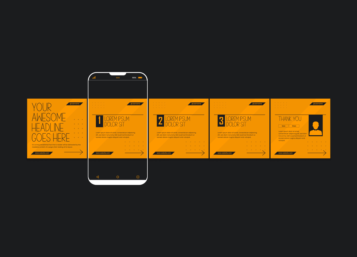
03. The Timeline
Slide 1: “How I grew from X to Y”
Slides 2-7: Key milestones, one per slide
Slide 8: Final takeaway + CTA
Why it works:
Chronology creates momentum.
And curiosity builds with each step.
04. The Side-by-Side
Slide 1: “Before / After” or “Bad / Better”
Slides 2-5: Split screen comparisons
Slide 6: Final takeaway
Why it works:
Humans love contrast.
This layout makes the improvement visual.
05. The Quote Stack
Slide 1: “What I wish someone told me”
Slides 2-6: Strong one-liners, same format
Slide 7: “Which one hit hardest?”
Why it works:
Saveable. Snackable. Scroll-stopping.
It’s tweet energy but visualized.
06. The Grid Reveal
Slide 1: “The 9 principles I use for X”
Slide 2: Grid with icons or small text
Slides 3-11: Zoom into each one
Why it works:
Hook them with the grid.
Then walk them through it piece by piece.
07. The Visual Explainer
Slide 1: “This confused me for years until I saw this”
Slides 2-6: One diagram, explained step by step
Why it works:
Everyone loves an “aha” moment.
This gives them one they can see.
08. The Process Walkthrough
Slide 1: “Here’s exactly how I do X”
Slides 2-6: Step-by-step with visuals or screenshots
Slide 7: Recap + CTA
Why it works:
It’s practical.
It’s generous.
It removes friction.
09. The “What Not To Do”
Slide 1: “Most people do this and it’s wrong”
Slides 2-5: Examples of mistakes
Slide 6: How to fix it
Why it works:
Nobody wants to look dumb.
Showing mistakes builds trust.
10. The Swipe File
Slide 1: “Steal these 5 X that worked for me”
Slides 2-6: Real examples (CTAs, hooks, etc.)
Slide 7: Bonus or download link
Why it works:
People want fast wins.
This hands them the blueprint.
Final Tips
→ Keep the layout consistent within the carousel
→ Use contrast: white space vs. bold type
→ Don’t over-design coz if it looks like an ad, they scroll
→ Make every slide feel like a win
Your visuals are only as strong as your layout.
Start with what works.
Then make it look like you.
Have you posed some of these?
Hey! Your post caught my eye on my homepage and I just wanted to send some support your way. Whenever you have a moment I’d be grateful if you could check out my latest newsletter. I’m always happy to support and lift each other up!
Great post with actionable insights 🤝🤝🤝